Here are various brochures I’ve worked on, including single fold, bi-fold, tr-fold, and gate-folds brochures.
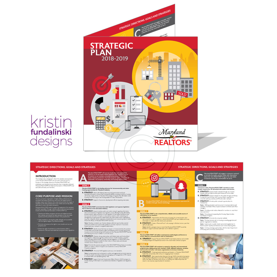
Job: Strategic Plan
Type: Bi-fold
Client: Maryland REALTORS®
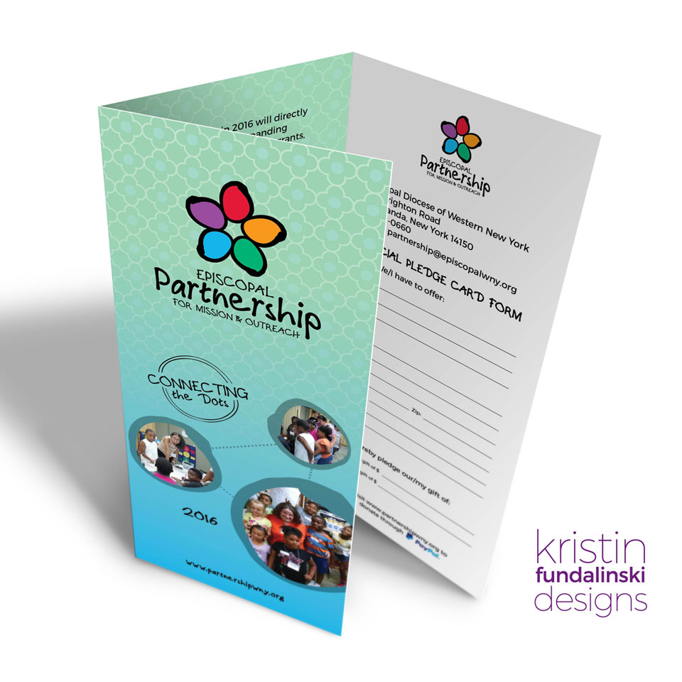
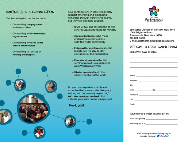
Job: Pledge Brochure
Type: Tri-fold Brochure
Client: Episcopal Partnership of WNY

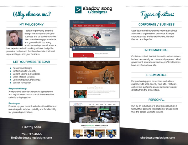
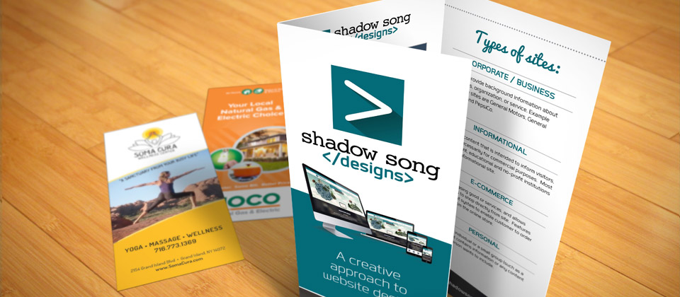
Job: Service Brochure (Website Designer)
Type: Tri-fold Brochure
Client: Shadow Song Designs

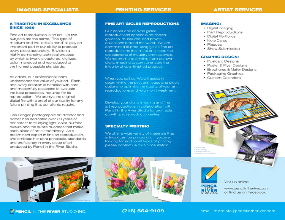
Job: Service Brochure
Type: Tri-fold Brochure
Client: Pencil in the River Studio, Inc.
Description:
Before I could design this brochure, the company was in need of a new logo. So I created that, along with creating a style guide for the company. The company specializes in photo reproductions for fine artists and this brochure was designed for their Artist Services. I used the repeating pattern of the waves, in the logo, to create texture in the blue ares. I used a thinner sans serif font to give it a sleek and upscale look.
Job: Corporate Brochure
Type: Tri-fold Brochure
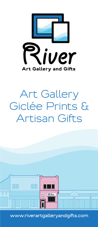
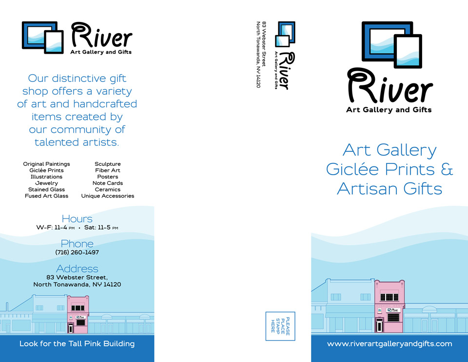
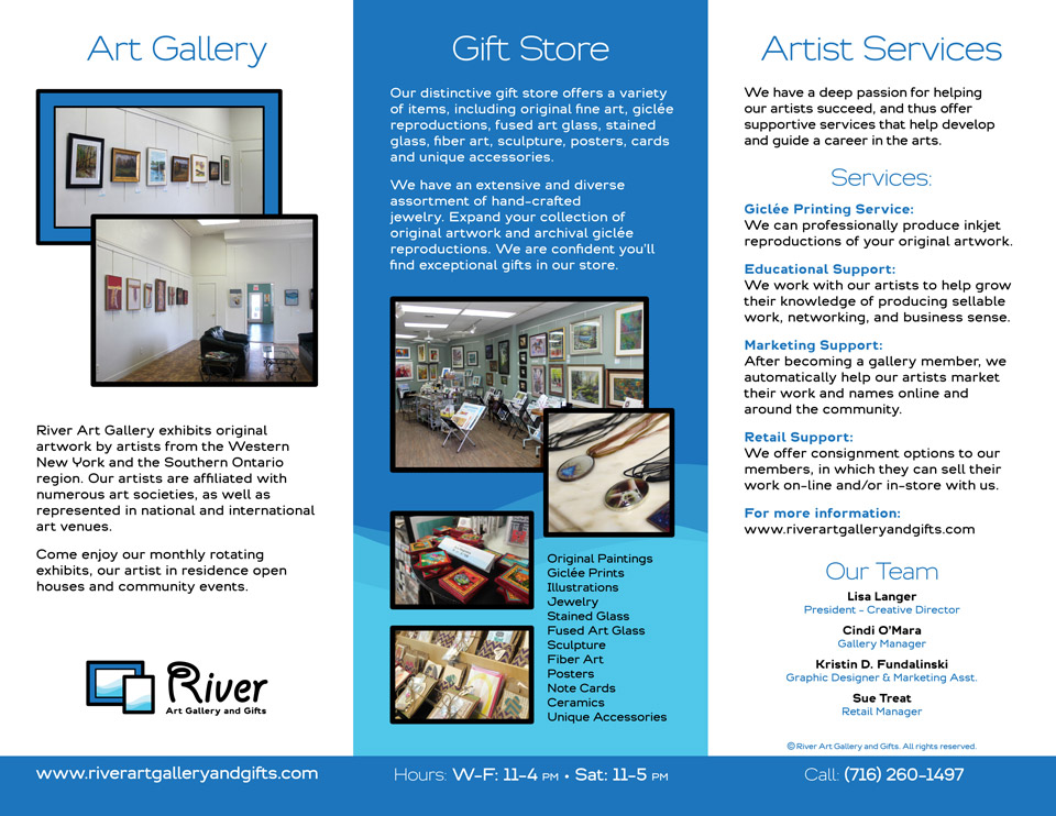
Client: Pencil in the River Studio, Inc. (River Art Gallery and Gifts)
Description:
Before I could design this brochure, the company was in need of an updated new logo mark. So I created the “frames” logo, which I used as graphic elements in the interior pages. The company also did not have a style guide, so I created their style. The company is an Art Gallery as well as runs a Gift Store, so the brochure had to speak of both of those elements. Since they are located in a very visible “Tall Pink Building” I wanted to capitalize on that for marketing. I created an illustration of the building and used it on the cover, as well as on another panel. I used the “waves” from inside the frames as a background and tied it into the logo.

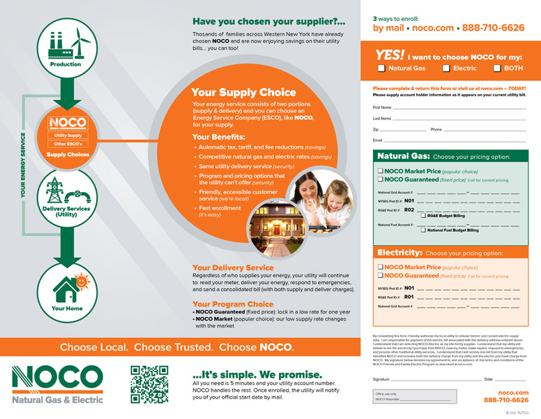
Job: NOCO Natural Gas & Electric Brochure
Type: Tri-fold Brochure
Client: NOCO Natural Gas & Electric
Description:
This brochure was the first step in establishing the NOCO style as before this brochure the company lacked a consistent style. Even though the style evolved over the next year, it remained very similar to this design.
Taking from the very geometric logo, I used circles for the picture boxes. I also used circles at the top to encase the product icons, just to add a little bit of green. I had taken the NOCO “N” and added it as a watermark to the background because I liked the “slashes” as a graphic element.
The inside was a bit more challenging with how to get across the concept of the product. It was decided to do a diagram, instead of just text to help describe it. The diagram had gone through many versions and in the end I decided that a vertical diagram, with icons in circles was the most organized way to get across the concept.
Involvement:
Layout design & style
Type setting
Photo manipulation/color adjusting
Interior diagram
InDesign Layout
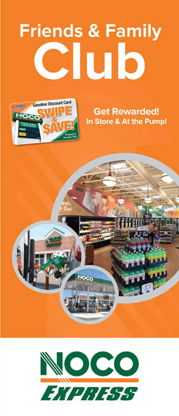
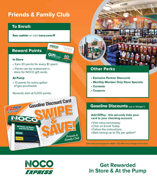
Job: NOCO Express – Friends & Family Club Brochure
Type: Bi-fold Brochure
Client: NOCO Express
Description:
Following the same style as the NOCO Natural Gas & Electric brochure I swoped out the images from NOCO Express images. I wanted to keep the style consistent. On the inside I desided to go with a tab sort of look, with the green bars on the top. I wanted to keep the different selling points separate to make it look more graphic and clean. I had taken the photos of the interior and exterior of the store.
Involvement:
Layout design & style
Type setting
Photo manipulation/color adjusting
InDesign Layout

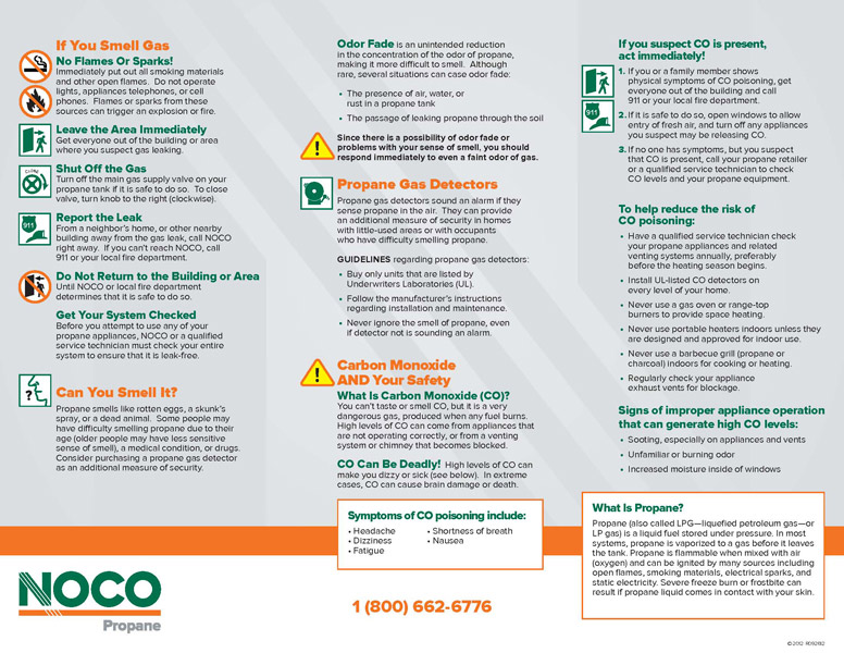
Job: NOCO Propane Safety Brochure, 2012
Type: Tri-fold Brochure
Client: NOCO Propane
Description:
This brochure was created to inform customers of safety tips with propane tanks. Using the established NOCO style I swopped out the photos. The bottom photo was taken by me of one of the employees. The inside of this brochure was very text heavy and didn’t allow for the addition of photos, which I prefer to do on brochures. Instead icons were used instead, which coordinated to the text copy it was next to.
Involvement:
Layout design & style
Type setting
Photo manipulation/color adjusting
InDesign Layout
NOCO
Marketing Materials